Where growth takes root.
Oakia Consulting


Oakia Consulting provides health and wellbeing coaching for business executives across Australia and the Asia Pacific.
Founder Deborah Madigan brings extensive experience from the human resources industry, having worked with both startups and global organisations.
As Deb prepared to launch her own coaching practice, she engaged Design Bug to develop a brand that would reflect the professionalism, warmth and personal growth at the heart of the business.
The Thinking
The project began with the development of the business name. Oakia was chosen for the symbolism associated with the oak tree – something that grows from a small acorn into a strong and enduring tree.
This idea of growth, resilience and long-term development reflects the purpose of Oakia Consulting: supporting executives as they build stronger careers, healthier habits and more balanced leadership.
The Identity
The brand identity combines warm, natural tones with clean typography to create a calm and professional visual presence. Pink was chosen to represent compassion and human connection, while earthy brown tones reference nature, grounding and dependability.
Together, these elements create a brand that feels both supportive and credible, aligning with the personal and professional transformation that executive coaching can provide.
In Practice
The brand was implemented across business stationery and a custom website designed to introduce the new practice to potential clients.
A simple one-page website was developed to clearly communicate the services offered while capturing the essence of the Oakia brand and providing an accessible starting point for the new business.
Project Details
Industry
Services
Location
More Feel Good Projects

Found Fitness

Innova Hypnotherapy

Sydney North Health Network

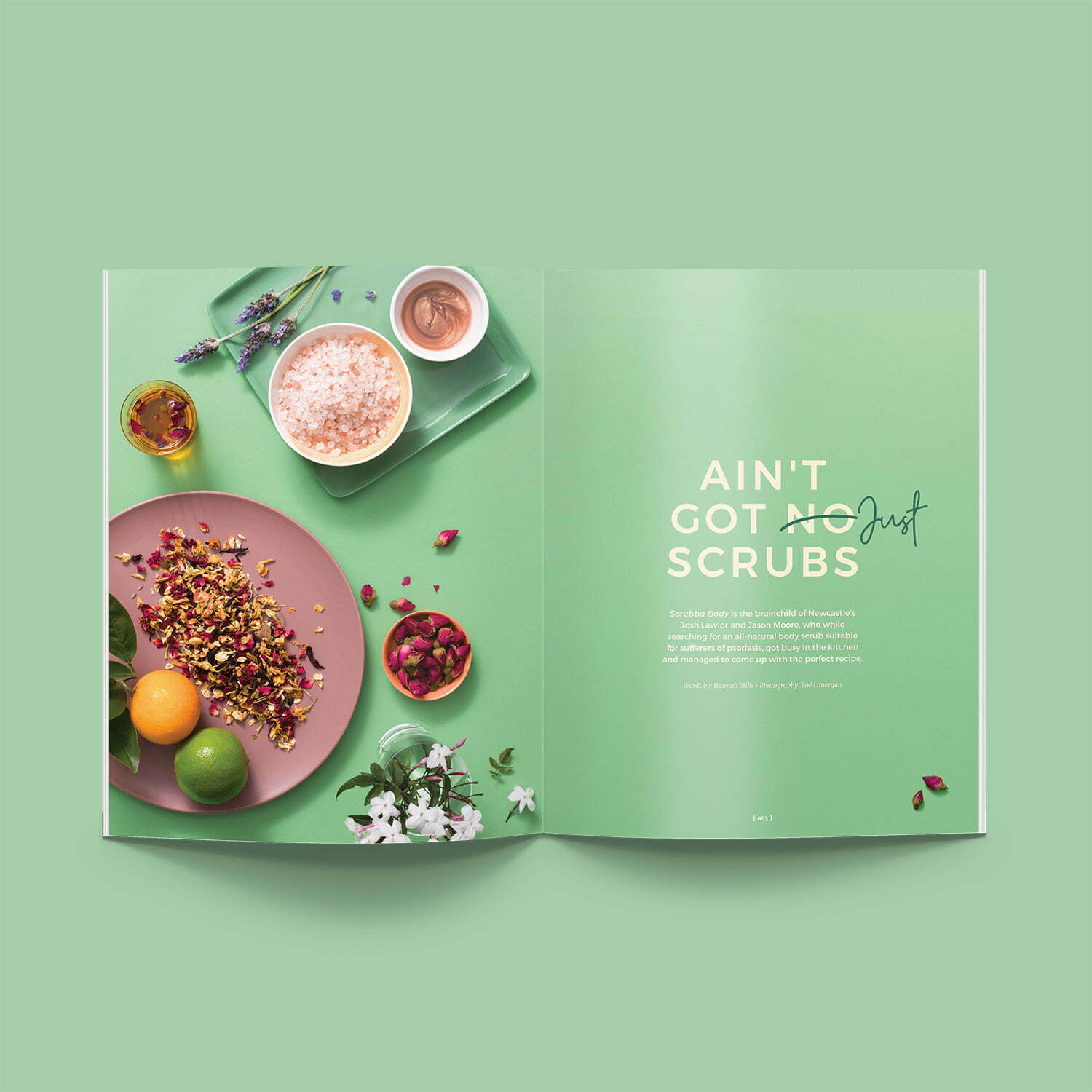
Newcastle Living Magazine

Merewether Podiatry

NUmoves Physio

Hunter Cosmetic and Laser
Groundwork Fitness

Clean Kweens