Where communication begins.
The Spot for Speech Pathology


The Spot for Speech Pathology provides speech therapy services exclusively for children in Kurri Kurri and the wider Hunter Region.
The practice supports young clients and their families through professional, engaging and compassionate care.
Design Bug was engaged to create a brand identity that would feel warm and approachable while still communicating the professionalism expected of a healthcare provider.
The Thinking
The clinic works exclusively with children, so the brand needed to feel welcoming and engaging for young clients while still reassuring parents of the clinic’s professionalism.
We created a brand identity that exudes vibrancy and approachability to appeal to both parents and the children they support. The direction balances playfulness with clarity, helping the practice stand apart from more traditional healthcare brands while still communicating trust.
The Identity
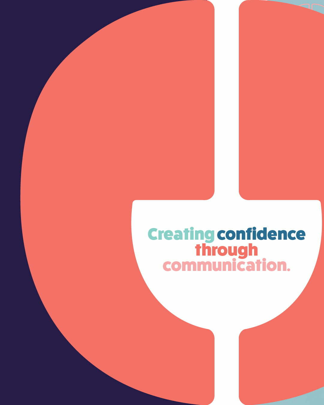
The logo was designed to be bold and friendly, with the ‘o’ in Spot formed from two speech marks facing each other to symbolise conversation and communication.
A warm palette of peach and deep purple was selected to create an identity that feels energetic yet grounded. Supporting graphic elements and a repeat pattern built from the speech mark motif add movement and recognition across brand materials.
In Practice
The identity was rolled out across stationery and marketing materials, including business cards, letterhead and social media templates. A supporting brand pattern derived from the speech mark motif adds energy and recognition across applications.
Project Details
Industry
Services
Location
The Thinking
The clinic works exclusively with children, so the brand needed to feel welcoming and engaging for young clients while still reassuring parents of the clinic’s professionalism.
We created a brand identity that exudes vibrancy and approachability to appeal to both parents and the children they support. The direction balances playfulness with clarity, helping the practice stand apart from more traditional healthcare brands while still communicating trust.
The Identity
The logo was designed to be bold and friendly, with the ‘o’ in Spot formed from two speech marks facing each other to symbolise conversation and communication.
A warm palette of peach and deep purple was selected to create an identity that feels energetic yet grounded. Supporting graphic elements and a repeat pattern built from the speech mark motif add movement and recognition across brand materials.
In Practice
The identity was rolled out across stationery and marketing materials, including business cards, letterhead and social media templates. A supporting brand pattern derived from the speech mark motif adds energy and recognition across applications.
Project Details
Industry
Services
Location
More Feel Good Projects

Found Fitness

Innova Hypnotherapy

Sydney North Health Network

Newcastle Living Magazine

Merewether Podiatry

NUmoves Physio

Hunter Cosmetic and Laser
Groundwork Fitness

Clean Kweens