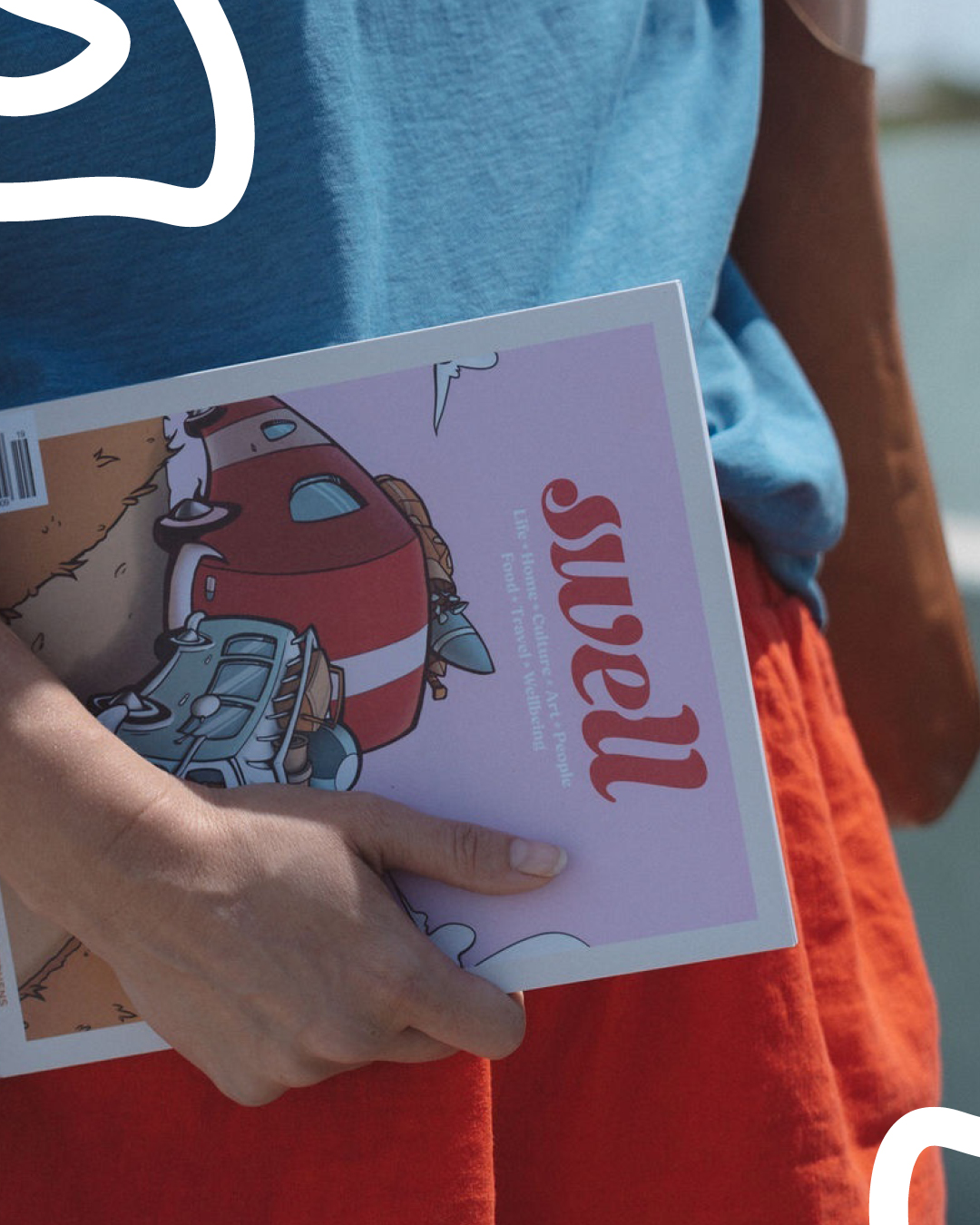
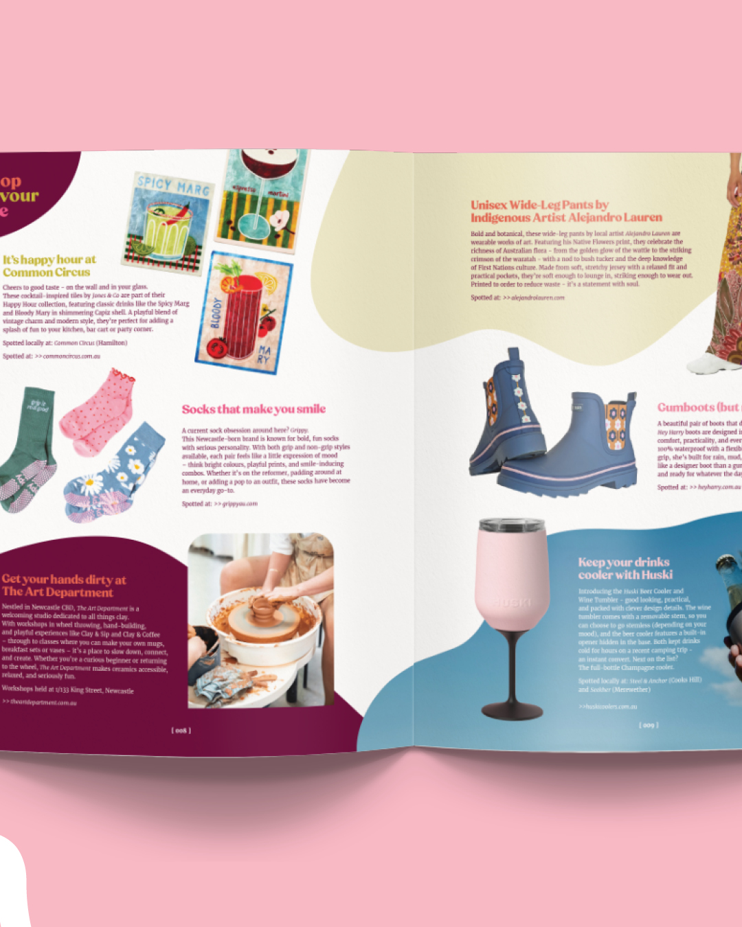
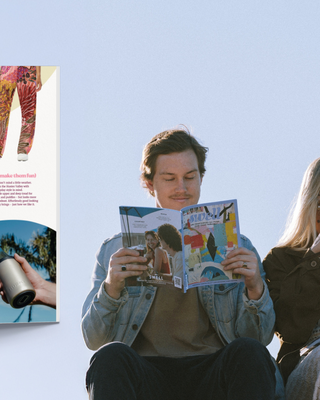
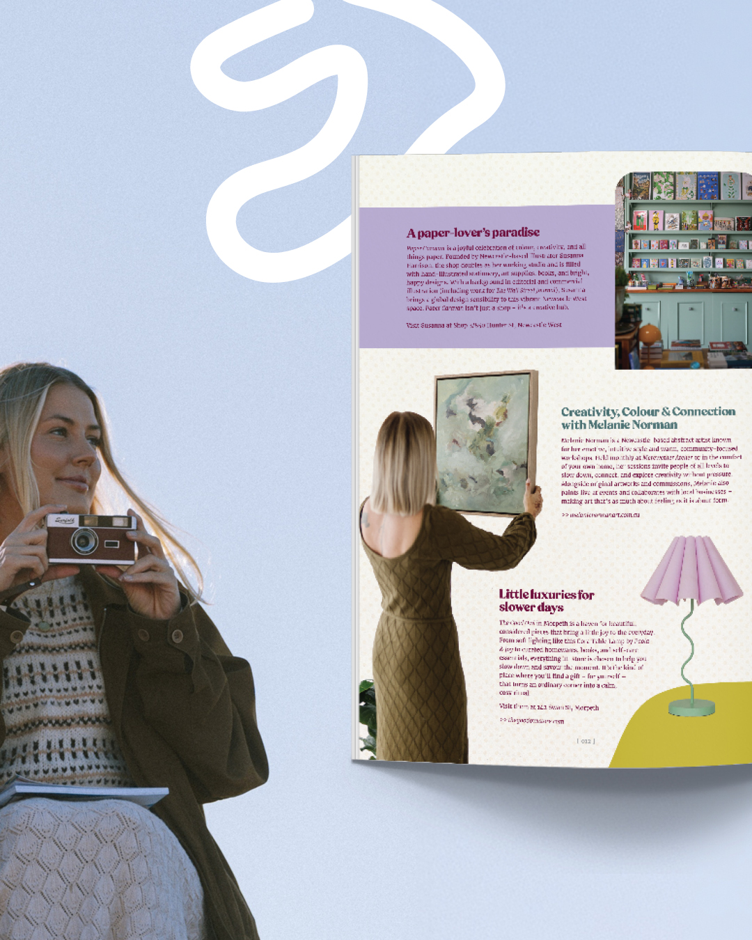
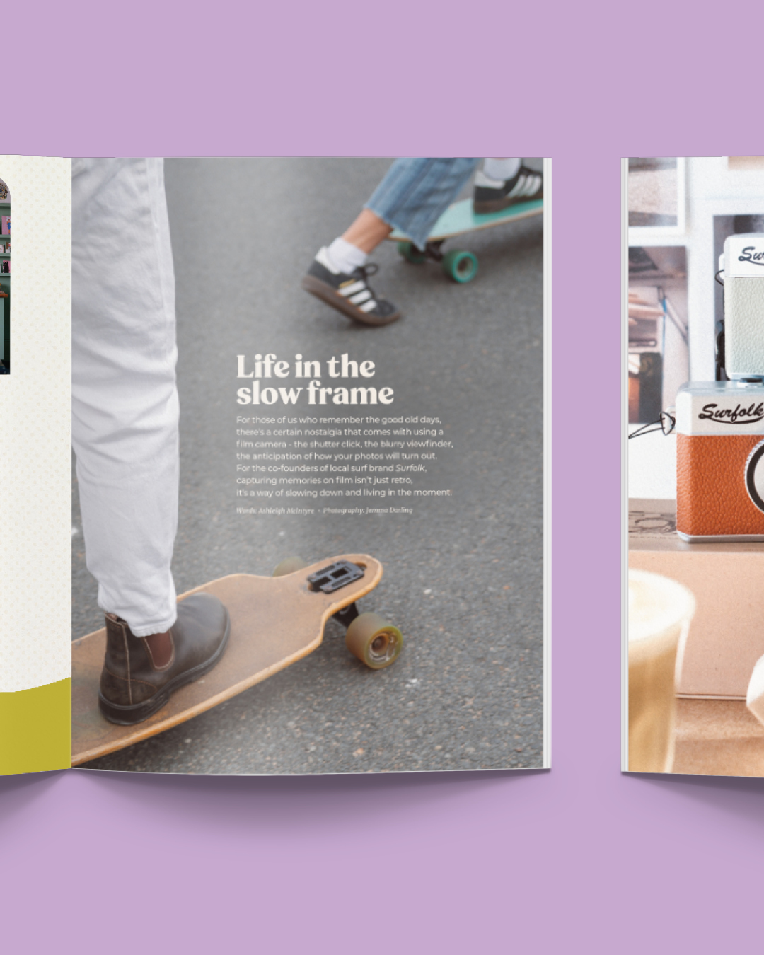
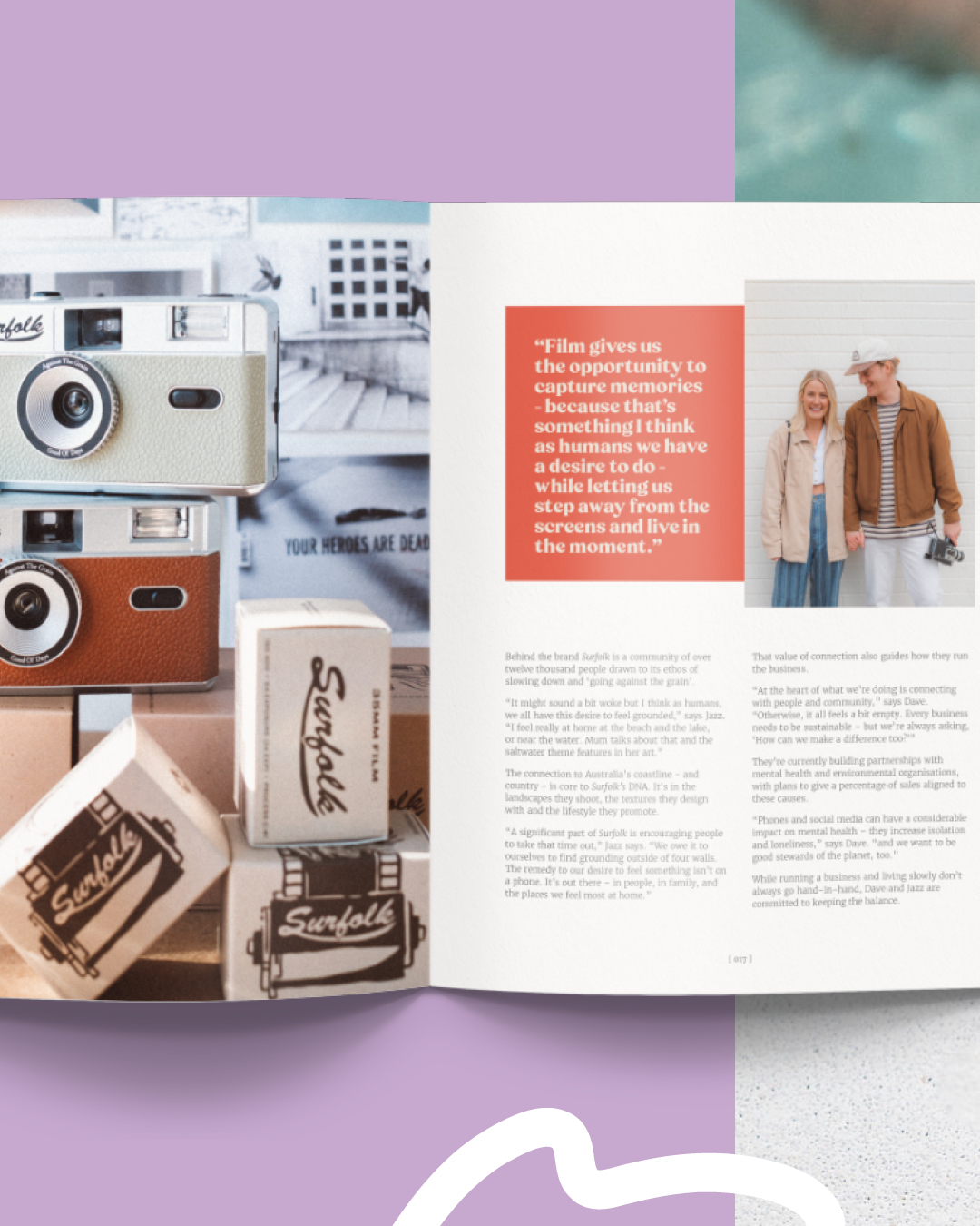
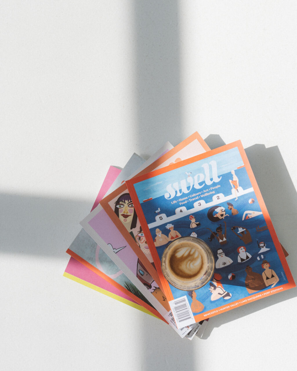
We co-founded Swell Magazine in 2018 because we wanted to make something worth keeping. Not a marketing piece or a brand awareness exercise. A proper magazine – the kind you put on the coffee table and still pick up six months later and find something in.
Twenty-five issues. Eight years. We had been designing long-form documents for clients across the sector long before Swell existed. But there is something particular about building a publication you own, cover to cover, twenty-five times in a row. The lessons compound. The systems have to hold not just for one issue, but for the next one, and the one after that. What Swell built in us was a way of thinking about long-form publication design that we carry into every brief we take on now.
We apply that learning now to annual reports for health networks, instructional guides for research institutes, and funding collateral for foundations. The brief is different. The design problems are not. Here is what we know.
A brochure gets read. An annual report gets returned to.
A brochure travels front to back in a single sitting. A long-form publication – a magazine, an annual report, a research guide – is returned to. Someone picks it up at a board meeting and puts it down. A minister’s office forwards the PDF on a Thursday; the policy advisor reads the community health section the following Monday. The chair flips to the financials first, every time.
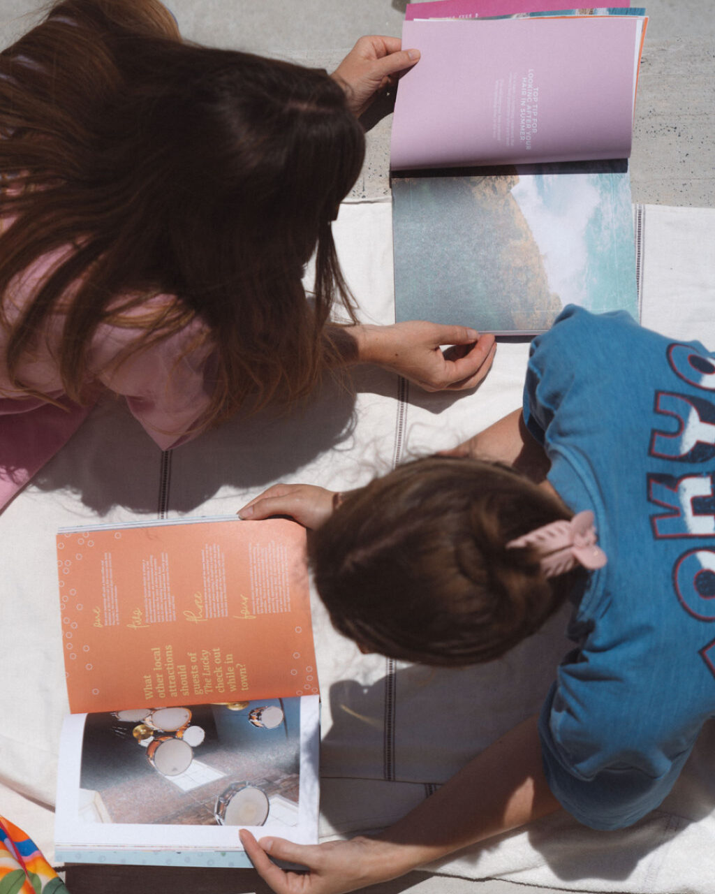
With Swell, we learned to design for the person flipping, not the person reading from the beginning. The magazine had to hold together for someone who opened it at page thirty-two as much as someone who started at the cover. That meant every spread needed to orient a reader who had no idea what came before: a headline that stood alone, a pull quote that paid off without context, a visual that did not require the caption to make sense.
We see annual reports designed like brochures constantly. Linear narrative, front to back, built on the assumption that the reader starts at page one and works through. They don’t. Designing for how the document is actually read, not how you wish it was read, is where the real work starts.
The reader you are designing for is not just one reader.
An annual report for a Primary Health Network lands in front of ministers, board members, funders, program staff, community stakeholders, and media. None of them read the same way. The minister’s office scans for headings and outcomes. The board member reads the chair’s letter and the financial summary. A community organisation looks for a mention of their program. A journalist searches for a number to quote.
With Swell, we built the editorial architecture around this. Pull quotes that carried meaning without surrounding context. Section markers that told you where you were regardless of how you got there. Subheads that did real work, not decorative work. Any spread in any issue should have been able to answer: where am I, and is this worth my time?
The same principle applies to every long-form document we design. The hierarchy of a page needs to work for the reader who gives it thirty seconds and the reader who gives it thirty minutes. That is a design problem, not an editorial one. It needs to be solved in the structure of the document before a single piece of content is placed.
Consistency is not sameness.
The challenge of running a magazine for eight years is staying consistent without becoming predictable. Every issue of Swell had to feel unmistakably like Swell. It also had to feel like this one was worth picking up.
Those two requirements are not in conflict if the underlying brand system is built right – but they feel like they are if it isn’t. Brand consistency in a long-form publication is not sameness. It is a set of constraints wide enough to accommodate change and specific enough to keep the document coherent. Get the constraints too tight and the publication looks rigid and dated within a year. Get them too loose and it looks like it was designed by a rotating team with no shared brief. Both outcomes are common.
Health organisations change. Programs end, new priorities emerge, the year’s story is never quite the same as last year’s. A good long-form publication system absorbs that change within a recognisable frame. When the brand system is correctly built, an annual report five years from now should feel related to this year’s without looking like a copy of it. You should be able to hold both side by side and see the same studio’s work – not the same document recycled.
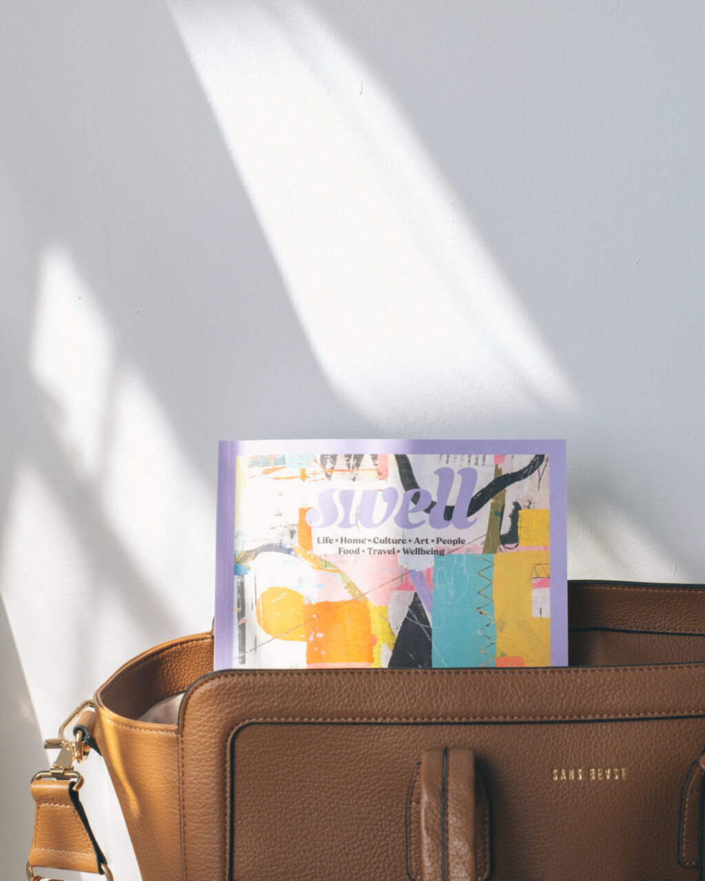
A cover is a promise.
A magazine cover is a compressed signal about what is inside. The covers that worked in Swell were the ones that told the truth about the issue. Covers that over-promised, or led with a visual that had no real relationship to the editorial inside, broke something that was hard to name and easy to feel. The reader opened the magazine and the contract was already broken.
Annual report covers are often treated as a branding exercise – something polished, something that reflects the organisation’s values, something the board approves at the end of the process. We would argue they are something more specific than that. A cover is a promise about the experience inside. If the cover signals rigour and depth, the interior needs to deliver it. If the cover signals warmth and community, thirty consecutive pages of financial tables without visual relief will feel like a betrayal of that promise.
Cover and content are a single design problem. They work best when they are solved together, not in sequence.
What this means for the work we do now
The briefs are different today. Annual reports for health networks and research organisations across Australia. Instructional guides for clinical teams. Funding and philanthropy collateral for foundations. Long-form communications for hospital networks, peak bodies, and clinical trials groups. We have been designing this kind of work for over sixteen years. None of it is a magazine.
But the design problems underneath are structurally the same. Long-form documents need to be built for the reader who returns, not just the reader who starts at page one. They need navigational architecture that works for a minister and a board member and a program officer, all with different time and different entry points. They need a brand system that holds across years without looking frozen. And they need a cover that earns trust before the first page is turned.
Eight years of Swell Magazine is why we can pick up an annual report brief and know, from the first conversation, where the real problems are likely to be. The brief looks different. The problems are familiar.
If you are producing a long-form publication and want a senior design partner who has done this before, we would be glad to talk. You can reach us through the contact page, or head to our print and publications work for more on what we do.


