A fresh chapter for a Newcastle publication.
Newcastle Living Magazine


Ray White Newcastle approached Design Bug to refresh the existing brand for Newcastle Living Magazine, an independent printed publication released three times a year.
While grounded in property insights from across the region, the magazine also shares lifestyle content, local stories and community-focused features. The rebrand needed to modernise the publication while creating a warmer, more engaging identity that reflected both the Newcastle lifestyle and the publication’s evolving direction.
The Thinking
Although Newcastle Living sits within the property space, its appeal extends beyond market updates alone. The publication needed to balance credibility and professionalism with a stronger sense of warmth, place and lifestyle, allowing it to feel more engaging to a wider audience. Drawing on our experience in lifestyle publishing, we shaped the brand and editorial direction to feel more community-minded, helping the magazine better reflect the character, energy and liveability of the Newcastle region.
The Identity
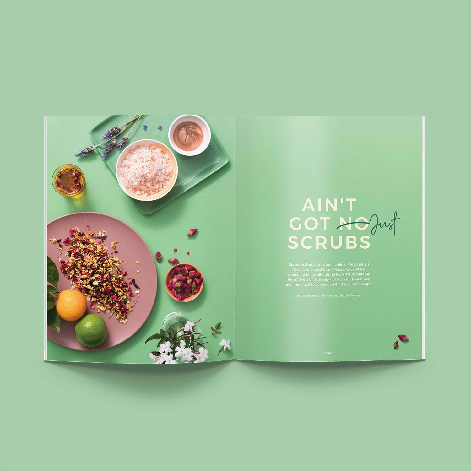
The refreshed identity was developed to feel warm, approachable and contemporary. A rounded sans-serif logo introduced a more welcoming tone, while subtle handwritten details added personality and a human touch. A palette of bold yellows and warm earthy tones was chosen to reference the landscape, energy and coastal lifestyle of Newcastle, creating a flexible visual system that could support both property content and feature-driven editorial.
In Practice
Since rebranding Newcastle Living Magazine in 2024, we have continued to produce three issues each year for the Ray White Newcastle team. Our role extends across design, writing, editing, curation and project management, allowing us to shape the publication from concept through to completion. This ongoing involvement helps ensure each issue feels cohesive, polished and aligned with the lifestyle-focused direction of the magazine.
Project Details
Industry
Services
Location
The Thinking
Although Newcastle Living sits within the property space, its appeal extends beyond market updates alone. The publication needed to balance credibility and professionalism with a stronger sense of warmth, place and lifestyle, allowing it to feel more engaging to a wider audience. Drawing on our experience in lifestyle publishing, we shaped the brand and editorial direction to feel more community-minded, helping the magazine better reflect the character, energy and liveability of the Newcastle region.
The Identity
The refreshed identity was developed to feel warm, approachable and contemporary. A rounded sans-serif logo introduced a more welcoming tone, while subtle handwritten details added personality and a human touch. A palette of bold yellows and warm earthy tones was chosen to reference the landscape, energy and coastal lifestyle of Newcastle, creating a flexible visual system that could support both property content and feature-driven editorial.
In Practice
Since rebranding Newcastle Living Magazine in 2024, we have continued to produce three issues each year for the Ray White Newcastle team. Our role extends across design, writing, editing, curation and project management, allowing us to shape the publication from concept through to completion. This ongoing involvement helps ensure each issue feels cohesive, polished and aligned with the lifestyle-focused direction of the magazine.
Project Details
Industry
Services
Location
More Feel Good Projects

Found Fitness

Innova Hypnotherapy

Sydney North Health Network

Merewether Podiatry

NUmoves Physio

Hunter Cosmetic and Laser
Groundwork Fitness

Clean Kweens
Swell Magazine
