A subtle shift. A stronger system.
Sydney North Health Network


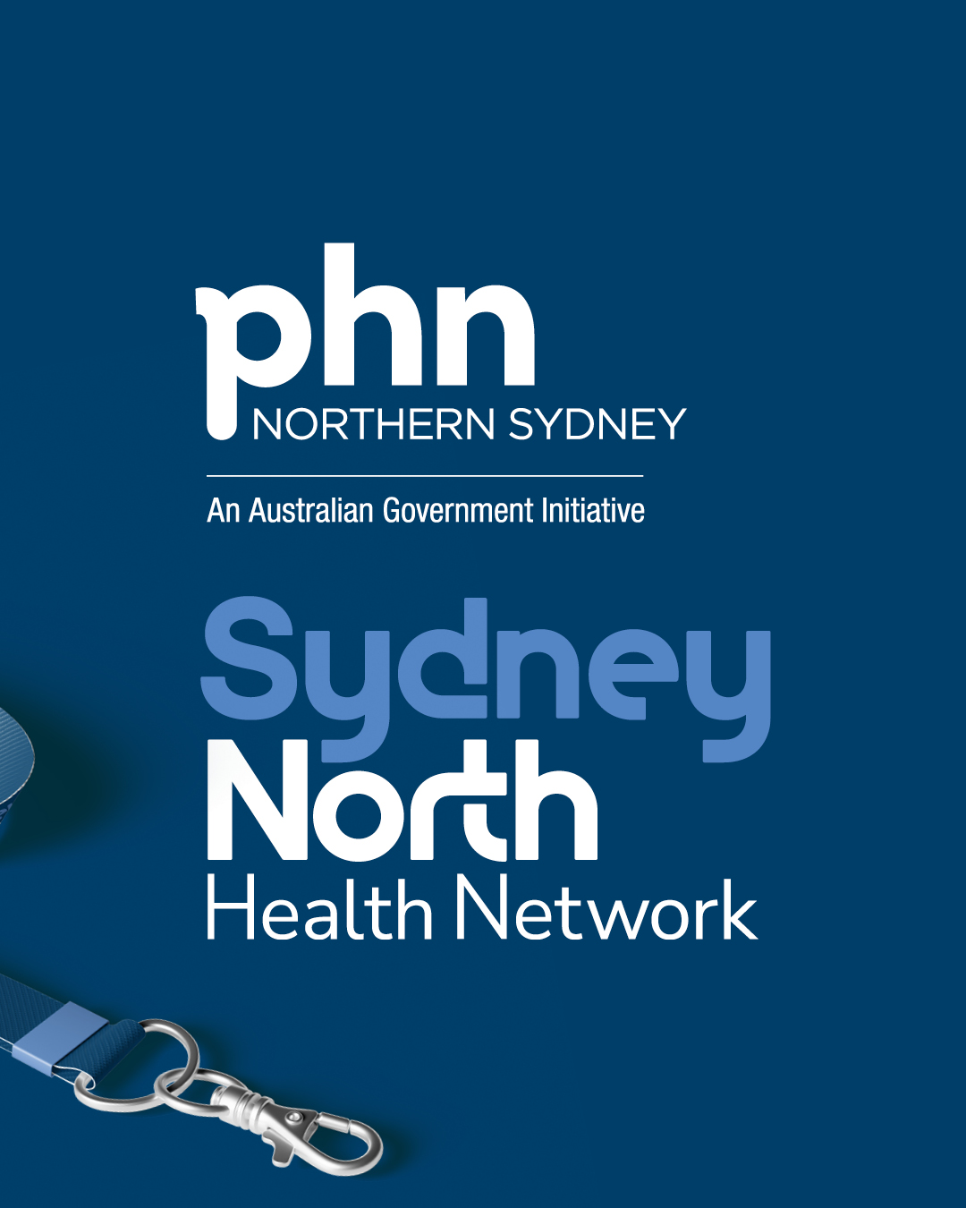
Sydney North Health Network required a refined brand identity that could sit seamlessly alongside the PHN brand while maintaining its own clarity and presence.
Rather than a full rebrand, the project focused on strengthening the existing system through subtle typographic refinement and the introduction of a broader visual language. The result is a clearer, more cohesive identity that supports the organisation’s expanding communications while maintaining strong alignment with the wider PHN network.
The Thinking
The goal was to refine the identity without losing the recognition already established across the network.
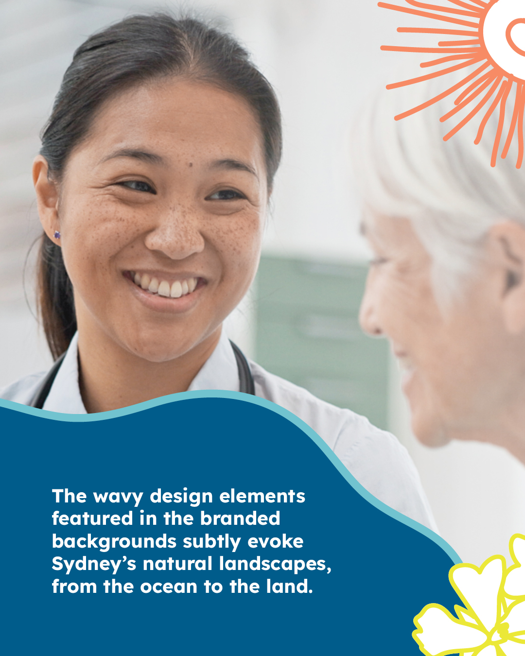
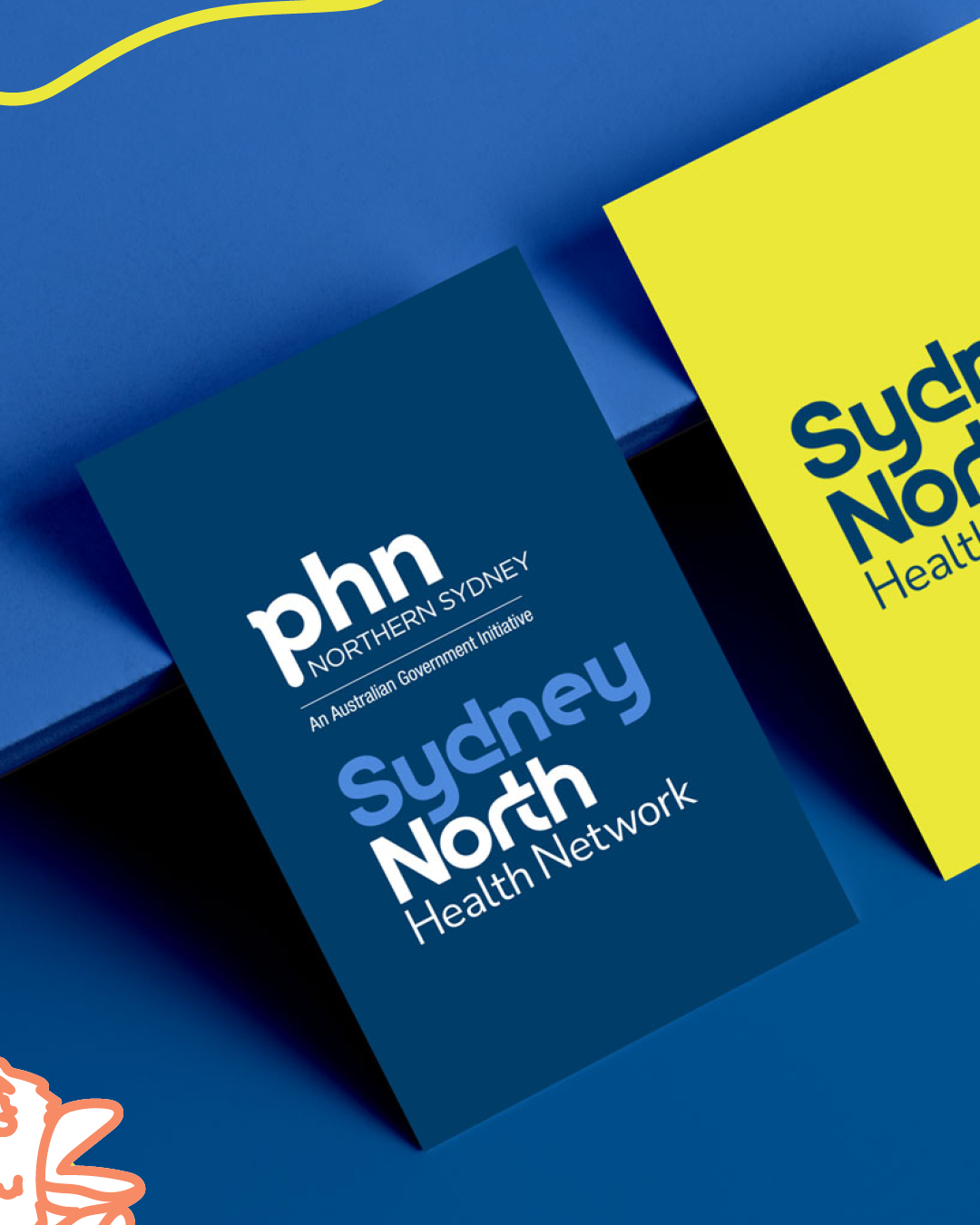
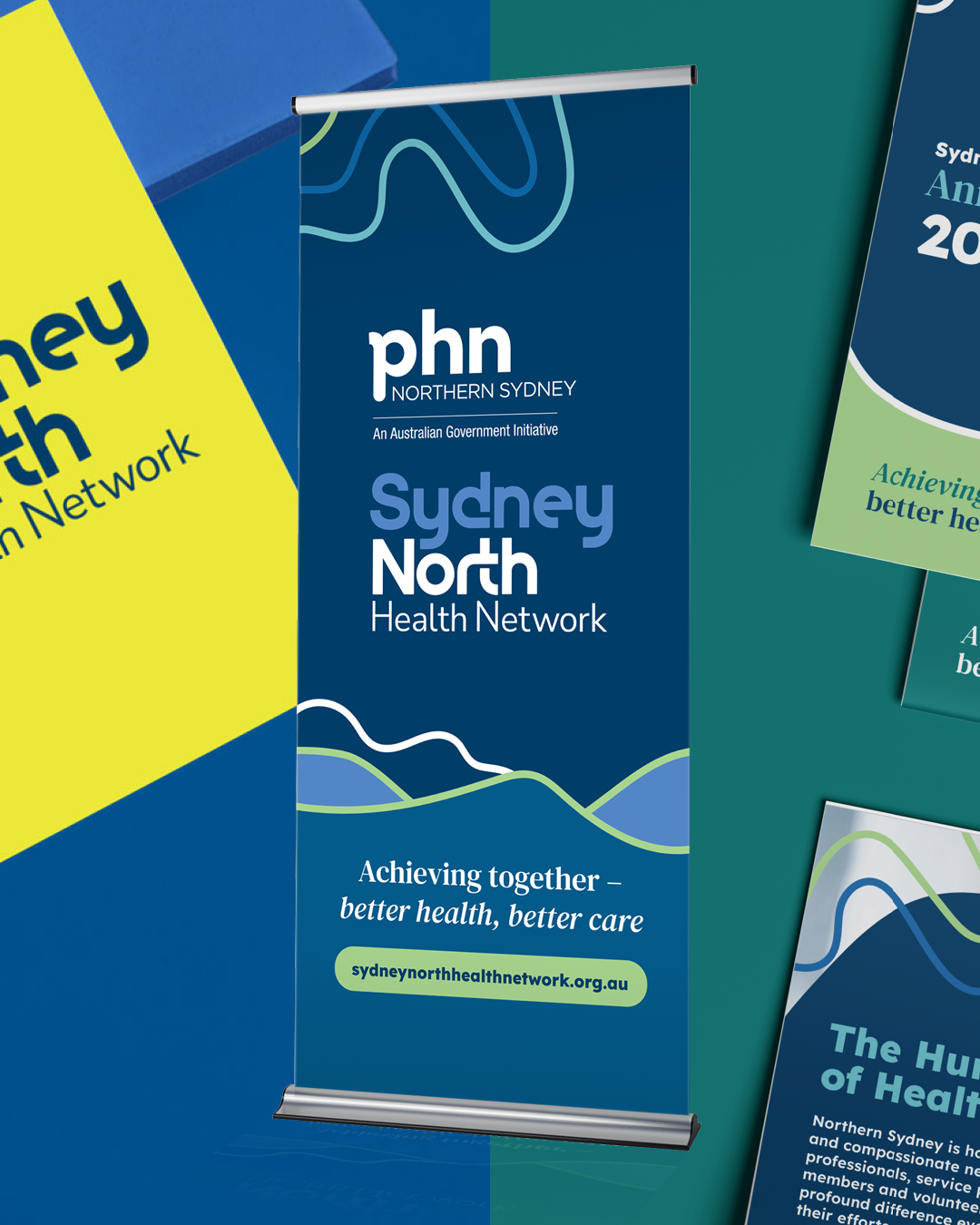
Subtle typographic adjustments improved hierarchy and legibility, particularly where the Sydney North Health Network logo appears alongside PHN branding. Emphasis was placed on “Sydney North” and “Health Network” to ensure clarity across communications, while an expanded colour palette and fluid landscape-inspired graphics introduced a more flexible visual system.
The Identity
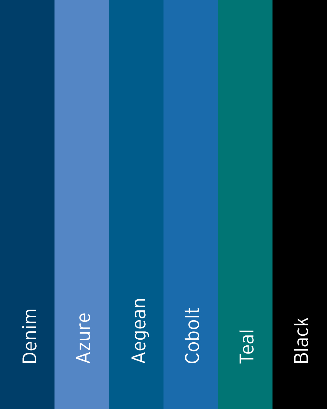
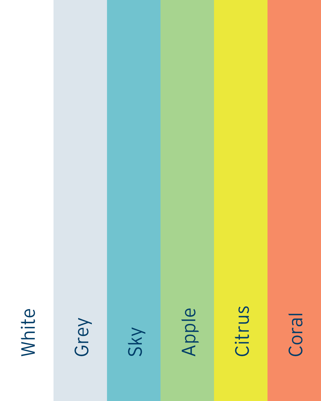
The refined logo maintains the structure of the existing mark while improving balance and readability. Subtle breaks and connections within the letterforms reference collaboration and the network’s role in connecting healthcare providers and communities. A broader colour palette supports the refreshed identity, with trusted blues complemented by brighter accent colours for warmth and flexibility.
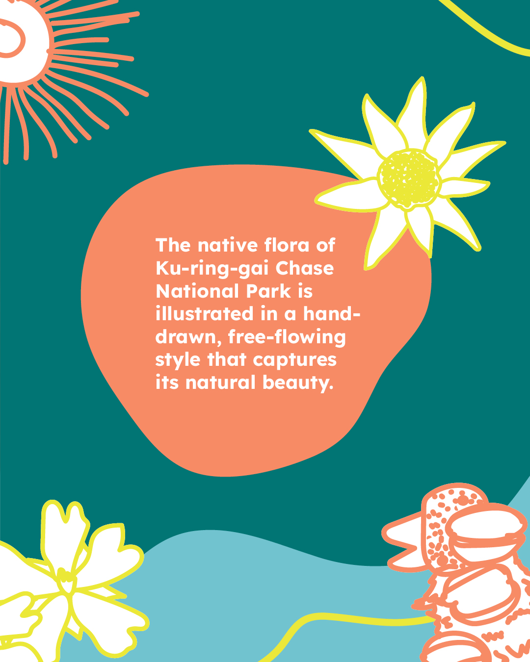
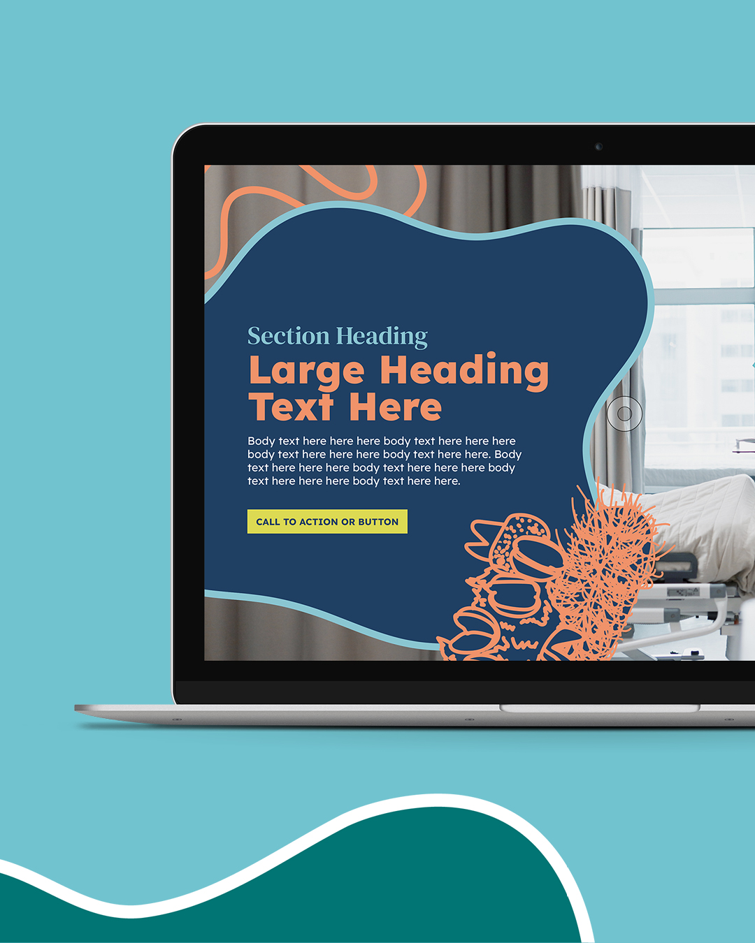
Supporting graphics were also developed to add visual interest and help create a cohesive and adaptable brand system across communications.
In Practice
The refreshed brand system was designed to support the wide range of communications produced by Sydney North Health Network, from reports and stakeholder documents to digital resources and community initiatives.
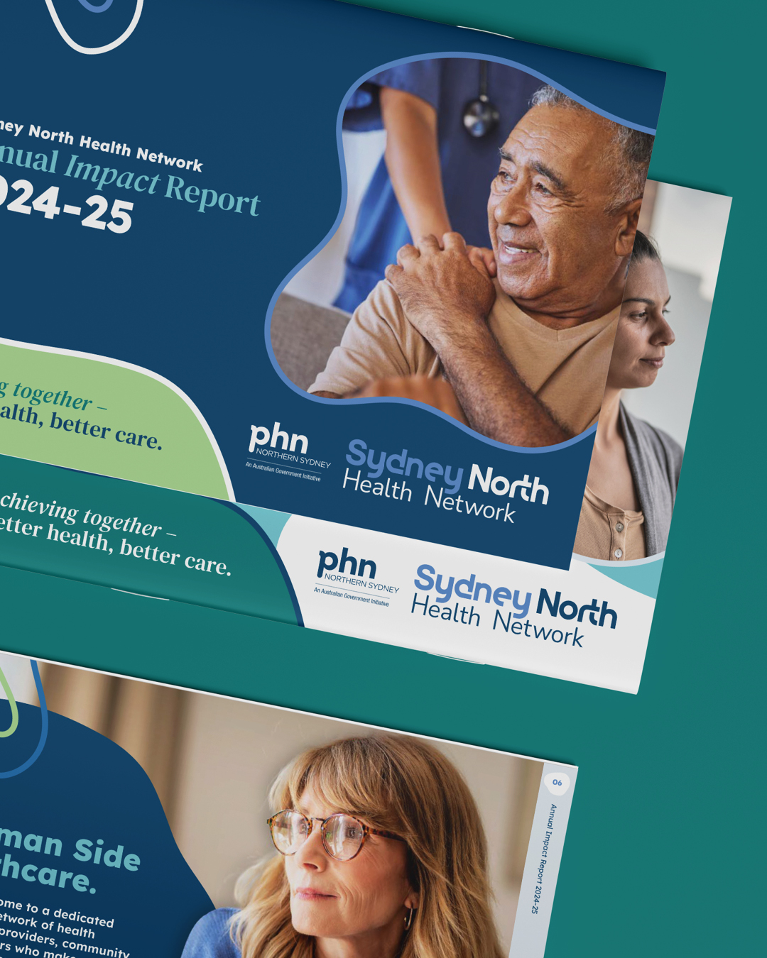
One of the first major applications of the new identity was the organisation’s Annual Impact Report, alongside a suite of templates developed for internal use. Landscape-inspired graphics and illustrated native flora provide recognisable visual elements that bring consistency and flexibility across communications.
Project Details
Industry
Services
Location
The Thinking
The goal was to refine the identity without losing the recognition already established across the network.
Subtle typographic adjustments improved hierarchy and legibility, particularly where the Sydney North Health Network logo appears alongside PHN branding. Emphasis was placed on “Sydney North” and “Health Network” to ensure clarity across communications, while an expanded colour palette and fluid landscape-inspired graphics introduced a more flexible visual system.
The Identity
The refined logo maintains the structure of the existing mark while improving balance and readability. Subtle breaks and connections within the letterforms reference collaboration and the network’s role in connecting healthcare providers and communities. A broader colour palette supports the refreshed identity, with trusted blues complemented by brighter accent colours for warmth and flexibility.
Supporting graphics were also developed to add visual interest and help create a cohesive and adaptable brand system across communications.
In Practice
The refreshed brand system was designed to support the wide range of communications produced by Sydney North Health Network, from reports and stakeholder documents to digital resources and community initiatives.
One of the first major applications of the new identity was the organisation’s Annual Impact Report, alongside a suite of templates developed for internal use. Landscape-inspired graphics and illustrated native flora provide recognisable visual elements that bring consistency and flexibility across communications.
Project Details
Industry
Services
Location
More Feel Good Projects

Found Fitness

Innova Hypnotherapy

Newcastle Living Magazine

Merewether Podiatry

NUmoves Physio

Hunter Cosmetic and Laser
Groundwork Fitness

Clean Kweens

Swell Magazine
